CSS3 属性
-
text-fill-color : color;
- 文字填充颜色
- 注:
text-fill-color和color一起使用 那么color不会起作用
-
text-stroke: width color;
- 文字描边
-
box-decoration-break: slice/clone;
- 在 CSS 布局中,总会存在元素 box 盒子断开的情况(page/column/region/line)
- box-decoration-break 可以决定断开时渲染的表现
- slice 切片、分割的意思,默认值。表示盒子断开部分如同切割一般
- clone 克隆、独立的意思,表示断开的各个盒子样式独自渲染
文字镂空效果

<style>
  body {
    background-color: #000;
  }

  a {
    font-size: 60px;
    -webkit-text-fill-color: transparent;
    -webkit-text-stroke: 1px #fff;
  }
</style>
<body>
  <a>Watch now</a>
</body>
文字渐变色
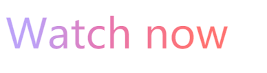
<style>
  a {
    font-size: 60px;
    background: linear-gradient(
      92.05deg,
      #bca1f7 12.09%,
      #e577b4 42.58%,
      #ff7170 84.96%
    );
    -webkit-background-clip: text;
    -webkit-text-fill-color: transparent;
    -webkit-box-decoration-break: clone;
  }
</style>
<body>
  <a href="#"> Watch now </a>
</body>
- background-clip 必须放在 background 后面不然不起作用
- background-clip: text 会将背景作为文字区域裁剪。
元素片段跨行、跨列渲染表现
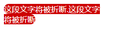
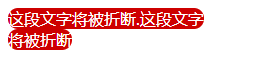
<style>
  .box {
    width: 200px;
    color: #fff;
  }
  .text {
    border-radius: 30px;
    background-color: #cd0000;
    /* 区别在这 */
    -webkit-box-decoration-break: clone;
  }
</style>

<div class="box">
  <span class="text">这段文字将被折断.这段文字将被折断</span>
</div>
参见